Typography and Paper:
with Jeremy Tankard’s Inuit font for Arjowiggins
introduction
Last year — although I’m pretty sure that this argument goes all the way back to Gutenburg — a debate on the subject of ‘Typography Overload’ blew through the blogosphere. The basic premise is that there are too many typefaces being produced, that there are just too many available. As a consequence, the protagonists argue, no decent human-sized brain can keep in touch and follow all of this; thus one is no longer able to simply chose a typeface to work with.
I come quite clearly down on the side that says ‘no’ to this proposition.
We always need more typefaces: there are always new needs to communicate, new ideas to share, not forgetting the need to communicate old things, but in new ways. And typography is all a part of that.
JT - Frutiger has a well known take on this to do with red wines. What is more worrying are the limitless versions of the same types, such as Bodoni. But there is a reason for doing them, no matter how ‘anal’ :)
Most people see the reason of designing a new type as purely monetary, but sometimes (many times) it can be for totally different reasons. From a marketing link as with AW Inuit, to adding characters as the EU expands, to re-working types as the technology advances (OpenType).
And so it is with great pleasure that we should welcome Jeremy Tankard’s Inuit to our design palette [or Type Manager, I use Linotype’s FontExplorerX, and you?]. And thank Arjowiggins for taking the initiative to commision, promote and give it away.
JT - Note that I was commissioned by the UK design company Blast. Blast are responsible for the visual design of the Inuit brand.
Please note, the typeface is ‘officially’ called Arjowiggins Inuit. I have shortened this to just ‘Inuit’ in this document. No disrespect or infringement is intended.
This is an expanded transcription of the short presentation that was given for the launch of Arjowiggins Inuit typeface at Intergraphic, Paris, France, January 16, 2006. I have completed my notes with comments and asides that were either cut at last minute, or would have provided distracting diversions within the framework of a 15-minute presentation. I am also including, when possible, outside links, to enable interested readers to get a more complete view of my chain of argument.
Asides that were not part of my original notes — like this presentation — are indicated by changes of colour in the text.
Please feel free to comment, to take me to task, or to complete this presentation. Typography is both a pleasure and an ongoing conversation, and I’m most pleased to welcome you to participate.
JT - Red rag to a bull!
[JM - additional comments — noted JT — appear where Jeremy has annoted, and corrected, this document. Wow. This is a really interactive medium we have here.]
providing a context for Arjowiggins Inuit

Frontispice to the Arjowiggins promotion material for Inuit paper - by permission of Arjowiggins
Inuit is two things at the same time. It is a typeface made freely available by Arjowiggins. It is also a new range of paper that is presented under this name. Arjowiggins commissioned the typeface from the English Type Designer, Jeremy Tankard. My role is to present this typeface, and provide some context.

The AW Inuit typeface - by permission by permission of Arjowiggins
In this presentation I will not only be presenting the Inuit typeface, but also seeking to situate Jeremy’s creation: first of all, within the context of his own work; secondly, I intend to place the typeface in the context of currents and ongoing discussions in Typography, as well as within a specific tradition in the field of Typography; finally, I hope to interest you in the idea that Jeremy works within a specific ‘English’ tradition. Along the way, I will, of course, be presenting the Inuit typeface, and — hopefully — sharing my pleasure at discovering it.


Disturbance © Jeremy Tankard - by permission
I’ll start off by presenting one of Jeremy Tankard’s previous typefaces, called ‘Disturbance’. Jeremy tells us that, initially, this was an attempt to create a 26-letter typeface — something that type designers have attempted at different times. As he continued, he found that this wasn’t really possible in this case, but he kept the spirit of mixed upper- and lowercase from the initial project. Incidentally, the face was named ‘Disturbance’ because that was the reaction from most people when he started showing it.
JT - Disturbance was put together at Royal College of Art. I was reading Bradbury Thompson and was captured by his experiments for ‘Alphabet 26’ used in the Westvaco publications. He used Baskerville and Baskerville small caps (letterpress) as they pretty much ranged. His choice of 26 characters did, to me, create visual problems. i.e. he used a cap I (eye) and a lowercase n (en) together they made ‘ın’ (imagine dotlessi, with n) to me this became a badly printed lowercase m (em). So I initially started to write in my sketch books in 26 symbols. Those that cam naturally made it into the font. Through my notes, I naturally made ligatured forms, these 10 additional ligatures were added to help the flow of the text. I also added ascenders and descenders to knit the text vertically and remove the impression of small capitals. It was initially called (rather blandly) AntiBrad, my lectures said ‘you can’t do this to the alphabet, its too disturbing!’, so it became Disturbance.
And, in keeping with my remarks about situating his work in a specific English typographical tradition, he states that the basic inspiration for the letterforms was our old friend Baskerville.
JT - I actually used Sabon as a base initially. Then it was redrawn for the FontShop International release in 1993.
We can see, even now, that Jeremy Tankard is not afraid of taking risks...
JT - I like type and letters, no matter where they take me. I am constantly intrigued by what you can do with such a simple structure. At the moment I am looking more at fairly traditional types. Occasionally I will venture off in a more oblique direction. Currently I’m working on a project aimed for release in 2010. Though if I get it completed sooner, all the better. The other day I had an idea for a set of types to compliment The Shire Types. We’ll see. I also keep thinking of going back to Disturbance and re-doing it as an expanded OpenType font in several weights and re-addressing it in textural use.

The other typographic tradition that I want to connect Inuit with, is the use of geometrical, rather than calligraphic, letterforms. Although we can argue that typography and calligraphy originally started to diverge around the time of Garamond where we start to see forms that are designed aesthetically and taking into account printing as a process as opposed to the pen, ink, and paper of calligraphy, another clear rupture point arrives with this document: a typeface designated as Two Lines English Egyptian that appeared in the Caslon specimen books at the beginning of the 19th century. From the name, we presume that this was an Egyptian face, with slab serifs, that had just had its serifs lobbed off. But here we have, in all its beauty, one of the first simple geometric forms. Later, these forms will become the Grotesque font families that we know and love.
There is also an argument that the reference ‘Egyptian’ was used merely to cash in on, or to associate with, the fat faces that were popular at the time. There is no documentary evidence for the removal of serifs from an existing typeface.

Jumping ahead to the early 20th century, here we have one of the most radical attempts to reform typography design. Paul Renner’s designs for what would become Futura.

What is interesting to note is just how radical is his approach. Look at those totally wonderful and over the top lowercase ‘g’s. I’m a bit sad that some of this never got into the final typeface.
JT - Though you can now get it in digital form — The Foundry does one.
And then look at what happened when the type designers got their hands on it.

The pure geometry in Renner’s approach has been re-appropriated into the typographical mainstream. I’m not going to say that this is a bad thing, particularly taking into account early 20th century printing methods, as well as the phenomenal success of the Futura family. But we can dream...

When I saw this sketch of Renner’s variations on a lowercase ‘a’, I loved it, as it is sooo [sic] close to Jeremy’s own sketches for Inuit. Similar ideas, similar problems. Clearly we are in a very similar design problem, and a similar tradition.
It would have been nice here to reference Bliss, as well as the English school of the humane sans-serif — Johnston, Gill, et al. We didn’t have time, and while the typefaces are delightful, they are not central to the pursuit of the geometric sans-serif... another time perhaps.
To continue with geometric sans-serif typefaces, I’d like to present Variex, a font family from the Emigre electronic type foundry, designed by Zuzana Licko and Rudy Vanderlans, in 1988. This is a truly amazing typeface — both then and now — and I’d like to provide some context for it.

Variex © Emigre type foundry
Originally, the typefaces developed by Emigre were bitmap fonts. That is, they were drawn pixel by pixel, dot by dot. There is a current in contemporary typography [although this goes way back — if I want to get really obnoxious and pull rank, I can also give you examples by Arrighi or Durer, that also seek to use a sort of ‘building blocks’ type design system. We could also consider the Imprimerie Nationale’s ‘Romain du Roi’, created to a grid of 2314 small squares, in the rational spirit of ‘the Age of Enlightenment’ as being built to a system. ] that seeks to exploit the creative possibilities that using a grid system, brings to building an aesthetic and usable typeface.
What I feel is interesting to note is that when PostScript fonts came along, and Emigre were no longer constrained to connecting the dots on the screen, they still sought to design a new system that they could work inside.
In the case of Variex, they sought to reduce the letterforms to basic geometric shapes. And these were not standing on the baseline, as is usually the case, but balanced around a horizontal centre line. This gives the forms a particular feel. As you can see on the sketch, weights were then created by increasing the size of the lines, but, again, from the middle. [As a sidenote, this means that the different weights have different x-heights, or what passes for an x-height when everything flows from the middle].
But the design is amazingly effective, and, when you look at Variex and think about Inuit, the use of pure geometry shows a clear family connection between them.
JT - As with Futura, pure geometry is an illusion. You can not design successful type with geometry.

Variex © Emigre type foundry
Off on a branch completely out on the side here, another thing that is interesting to notice is what Zuzana Licko is doing today with typefaces like Mrs Eaves [and the lovely Filosofia]. Mrs Eaves is her reworking of Baskerville, while retaining all the radicality of the Emigre approach, but in a more subtle manner. Even if typographers coming from the calligraphic tradition do raise their hands in horror, I — and this is my personal opinion and completely out on the side as I said — think that it is a most wonderful achievement, a lovely design, and I can’t wait for someone to buy both of these families for me. [As an aside, it is interesting to parallel Zuzana Licko’s progression through typography to that of Jan Tschichold, who also professed a very radical approach in his youth, before working more in the mainstream of typographical tradition and creating a font like Sabon.]
I’d also like to point out two other typefaces by Jeremy Tankard, other than Disturbance, that also use some sort of formal system. In his case, there are two obvious choices:
- Aspect, where the idea was to create an upright script, including script flourishes. It is an outrageous proposition that rubs against all we know about scripts, but the result is there.
JT - Aspect was commissioned for the new Christchurch Art Gallery, New Zealand. - Blue Island, where Jeremy sought to create a typeface that was entirely built around ligatures. Individual letters have a hard time existing, but once combined into words, the novelty of the idea becomes apparent. [I have no idea what he puts on his breakfast cereals that gives him ideas like this, but it is a fascinating, and, as far as I know, unique attempt in the field of typography].
JT - Blue Island is part of the Adobe Originals collection.
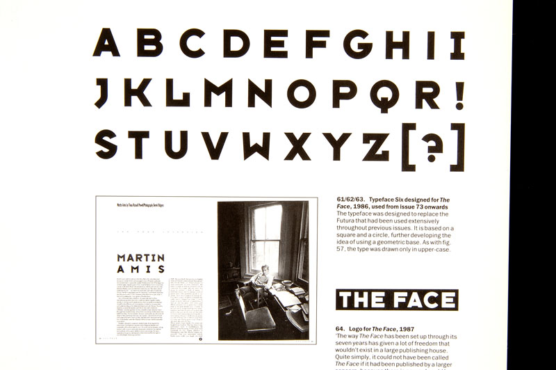
Extract from The Graphic Language of Neville Brody.
Talking with Jeremy this morning we both characterised Inuit as a display type, although Jeremy remarked that, as a body type, it wouldn’t have been out of place in something like The Face at a time when it would have stood besides Neville Brody’s font experiments in that magazine.
This is an interesting point as Brody, like Jeremy, is not someone coming from the calligraphy-based current in typography: he also liked to experiment with pure geometry in letterforms. In fact, I’d go so far as to link Brody’s xeroxing, hand lettering, cutting and shifting forms right back to that original Caslon ‘Egyptian’ typeface — I’m sure that he would also have felt it as perfectly normal to snip off the slab serifs in order to free the letterforms, to move into new design territories.

© Pierre di Sciullo
Coming back to Inuit for a moment, Jeremy notes that when he was first approached to design a font, the idea was to create an alphabet for Inuktitut, the syllabic alphabet used by the Inuit people, the native people living in Canada’s northern territories. This was quickly abandoned as it proved to be too complex a task to mix the letterforms needed for western languages with the original letterforms.
JT - The brief was to design a typeface in the Inuktitut syllabic style that could be used to set Latin text. So it was always to design a Latin-look-a-like. It would’ve been interesting to do a true Inuktitut font, but this wasn’t in the scope of the brief, as it were.
However, there is an obvious parallel here with the work carried out by Pierre di Sciullo in creating a series of alphabets for the Tuareg people. Pierre’s work is too complex to treat it here, and it would be a disservice just to gloss over it. Instead I prefer to provide a series of links that those interested can use to obtain more complete information.

© Pierre di Sciullo
What is interesting to note is that, here again, we are again dealing with a language that does not have a strong written culture, and again, we are presented with geometric letterforms, rather than forms that draw on a more calligraphic tradition of typography. Another parallel with Pierre di Sciullo’s other work is his use of systems and grids as a container or framework for his typographical creativity.
Links for Pierre di Sciullo:
- Qui Résiste
- The Amanar — click on the arrow in the left column for see the following pages
- Primea Linea
Arjowiggins Inuit

AW Inuit font - used with permission
There is more complete information on Jeremy’s creative approach, both on Arjowiggins site for this paper, and on Jeremy’s own site. I recommend that you also download his Footnote No. 5 that contains his notes on Inuit.

Ligatures from AW Inuit font - by permission of Arjowiggins
For me, this illustration points to another bridge between Jeremy Tankard’s work for Inuit and the mainstream current of typographical tradition. Initially ligatures were very present in early typefaces. So much so that they were often used as a ‘paper’ trail when tracing copies and working back to find the original fonts and creators. The original type designer would take pride in providing a complete set of ligatures and flourishes, whereas the copiers, generally working as quickly and as cheaply as possible, would provide the minimum, or even none at all. This also depended on their source material. Even a conscientious copier was obviously working from a published document, and the necessities of that particular text would probably not include all the ligatures that were originally created.
JT - The use of alternates and ligatures goes against the simplicity of a syllabic structure, but AW Inuit is its own thing and follows it own structure.
Old-style figures are another feature that have [rightly] come back into favour, and I’m delighted to see these present here.

Old-style figures from AW Inuit font - by permission of Arjowiggins
creating the letterforms


Document Arjowiggins - used with permission
The Inuktitut alphabet uses rotated and reflexive letterforms. This is a trait that is alien to modern western alphabets, and we can see here the moment where Jeremy abandons western-style pen strokes, as they are not conducive to rotation and reflection. Typography based on pen strokes uses specific thin and thicks. It is not possible to simply rotate and reflect these without either providing forms that would appear aesthetically ‘ugly’ to our eyes, or to completely redraw the forms for the new positions. But then we lose their true nature as rotated and reflected letters. This is the moment when he felt that he had had to adopt a geometric approach.

James Evans’ syllabic alphabet

Sample text of Pitman’s shorthand
Probably based on Pitman’s shorthand — a logical approach, as this also provides for a syllabic breakdown of words, and encourages the use of rotated forms — the Inuktitut syllabic alphabet also uses both small —index like — and large letterforms.

Document Arjowiggins - used with permission
These should not be confused with upper- and lowercase forms — themselves absent from the alphabet — Jeremy proposes that they are in fact closer to the use of superior letters commonly used in abbreviated word forms. Generalising this in a western alphabet is not really something that our eyes are prepared to deal with.

Document Arjowiggins - used with permission
Finally, when reworking the letterforms to conform to something closer to our reading habits — the introduction of ascenders and descenders — he was able to keep the feel of the superior forms, without compromising legibility.

Document Arjowiggins - used with permission
He also played with the idea of using the stress accent — drawn as a dot, or like an above ring —˚ — accent present in Scandinavian alphabets — as a means of signifying capital letters.
Document Arjowiggins - used with permission
This could have been another means to respect the appearance and the graphic texture of Inuktitut printing. But he abandoned this as not being practical [not counting the aforementioned Scandinavian alphabets where the presence of this accent would create confusion between the capitals and the properly accented lower-case vowels]. He did however retain this form of the stress accent for punctuation as well as the ‘i’ and ‘j’ dots. For him, this presence was sufficient to keep the spirit and the feeling of the Inuktitut alphabet alive in what had become his own creation.
The AW Inuit typeface - by permission by permission of Arjowiggins
Next week, Arjowiggins will be making this typeface freely available for download from the Inuit paper web site. Then everyone will able to use it, to bring it to life, to adapt, change and extend it.
To conclude, I’d like to make a suggestion: that Arjowiggins release Jeremy Tankard’s Inuit under a Creative Commons ‘Non-commercial / Attribution / Share-alike’ licence. This should ensure the different right-holders’ rights are respected, but allow others to continue and extend the work that Jeremy has started, to extend the typeface into European languages, and other weights.
Special thanks:
- to Benoît Higel who MC’d the presentation, and gave a fascinating glimpse into his own conference on ‘Black and White’;
- to Saïda Berrahal, from ArjoWiggins, for inviting me, and making everything go so smoothly;
- to Étienne Hervy, from Étapes magazine, who most gracefully passed on his notes when he had to pull out at the last minute — it was a kind gesture and most appreciated;
- to Peter Gabor, for encouraging me to go out, and just do it;
- and finally to Jeremy Tankard, not only for a fine typeface that I’m sure will prove useful and provide lots of pleasure to many, but for also taking the time to chat with me by telephone, answering with extreme patience my dumb questions. He was also kind enough to send me a mass of complementary documents and documentation from his own hard drive. And finally, he added his comments to this very post. Thank you, sir!
This post was written by jonathan for Design & Typo and initially posted January 20th, 2006.